Tuesday 21 June 2016

End of year show- work displayed

https://www.youtube.com/watch?v=sL9Ruquk4II- ( End of year show work)

This is my work that was displayed at the end of year show. At the Surface Gallery. I like the fact that it was shown at the gallery last Friday. I also like the fact that I have used my own music- my piano talent to use for the project. I enjoyed having it displayed at the end of year show for lots of people to see.

One of my favourite parts of my video was the way that I created the fish swimming type sound. I made this sound by myself using a sound recording/ music making software of Audacity. Then I found a cup of water with a straw. Next I blew through the straw into the water whilst recording the sound. Then I blew on the straw through the water to create the fish effect. I found it great to create this using my own skills, to show what I can accomplish in little time. Also it shows what I can create using my own talents.

The things that I could improve in my video is the length of it. If I was to do this again I would change the length and make it longer. I would possibly use more of my own sounds to make the  video look and seem better. I might even change some of the effects so you can me in the actual shot. This could be displayed on a TV programme as it is to do with a video. It could show the different emotions between the music and the character.


Monday 13 June 2016

Extra Research- Ryan Kelly(the artist)

. He was born on the 29th January 1976
. He is an American comic book artist creating things like Funrama
. Ryan Kelly now teaches younger students with classes on how he draws his comics
. He has moved on to work on other comic books
. He has produced illustrations for the Time Magazine , The Rolling Stone and others.

http://www.comicbookdb.com/creator.php?ID=2010- Ryan Kelly


Friday 10 June 2016

Extra research- different fonts and typography used in comics

https://s-media-cache-ak0.pinimg.com/736x/c0/42/a3/c042a351a8b27043088c47dfebccd311.jpg
I like this font style because of the colours that has been used in the font. This gives the font an interesting effect when it is in a comic. It also gives the audience a sense of what is happening. I like the shape around the word. This is because it makes it stand out more. It gives the effect of a sudden movement for the comic. The colours of the word work very well with the lettering. The yellow gives the wow effect. As if something wrong or an explosion has happened.

I like these typography fonts because they give the effect of a comic. I don't like the colours because it is black and white. I don't feel as though it shows the emotions getting through the comic. I like the different styles of each of these fonts because they show what the word is supposed to show. Without using pictures. I feel like the words express the feeling of the comic when they use. This is because they work in a comic strip.

I like these fonts because they give the information that it says on the lettering. I like the colours that each of these fonts show because it looks effective. Some of the fonts on this image have pictures showing what the word means in a comic strip. I also like the fact that the words and the lettering of each of the fonts exaggerate with the word. The colours are very colourful which I like because it shows that it looks better in a comic strip then by itself.

I like this comic font because it makes the words stand out. The colours used on this font is bright colours showing that it is supposed to be in a comic. I also like this comic font because I feel as though it would work well in a comic strip. This is also because of the fact that the font is bold with the colours. Also the size makes the font seem more bold.  I also like this font because of the word. This is because of the word gives the bold effect. Boom also gives the comic if it was on it a great effect.

I like these comic fonts because it shows what the comic is trying to show through these words. I also like the colour of the fonts because they show how bright they are shown in comics. The fonts bring out the style of the comic. Also these styles of fonts look like they have a cartoon, comic style which shows that they should be used in a comic. It looks as though they are jumping of the page as they are brightly coloured and because of the boldness.


Monday 6 June 2016

Presentation


  I have made a power point on my final piece for my project. I think that my presentation has gone very well. I like the fact that I did some prep cards that helped me with my presentation. Also i feel as though I did a good presentation. The way that I went into detail really shows how much my presentation has gone well. Also my presentation went well because of the fact that I have used photos to help me explain my process.  


Friday 27 May 2016

Evaluation

The assignment brief was to create a piece of work of your choice. You could have chosen to do photography or some sort of graphic piece/style.

I chose to do a graphic piece of work to show my interest. Also I wanted to do a graphic piece of work because I like to draw. Also doing a graphic piece would show that I can use photoshop to create a comic strip. I have also chosen the graphic path for my final major project because it shows what I can create on  different software's including photoshop and illustrator.

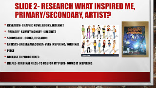
The research that I did was to research different comic strips and graphic novels. This was to get me some ideas on what my project was all about and what I wanted to create in the first place. Also I had to research an artist called Angela Anaconda to get some ideas for my project. I also took my own photos of my bedroom to use for my comic. This was because it looked like the scenes that I wanted to portray through a comic. This was so I could use my own photo of my bedroom to stick into my comic strip.  This was to make my comic strip seem/look more real. Also it looks better with a background in each of the scenes pretty much as it looks like a realism piece of work/artwork.

The research that has inspired my design was my secondary research because it showed how other people made their comic strip using their own drawings and graphics. Also my primary research was inspiring because it showed what other people thought/think of my overall design/idea. The artist that inspired me with my design was Angela Anaconda because it showed how she uses mixed media to create her final piece and her final artwork piece. She also inspired me because it shows how she creates her pieces of work using photos and her own style of artwork.

My primary research was when I created a survey monkey questionnaire to see what other people thought of my final piece ideas. I didn't get that many replies which was annoying. This kind of affected my final piece because I didn't know exactly what other people would have liked me to do by their responses. Also it would have helped if other people gave their overall opinions that I could use for my final piece. Also it would have helped for more people to have answered my questionnaire because it would have meant that I had more of a sense for a target audience. This wasn't as helpful as not many people replied.

My Secondary research was all to do with graphic novels and comic strips. Aswell as looking at books to do with how to draw faces and characters. Also with this research I could get a sense of how other people do their style of work- that I could have used to create my own piece to follow in their success. Also my secondary research was helpful because it showed how different pieces of work make one successful piece which I liked. Also my secondary research shows how the artist sees the piece that they created which also inspired me.

I have made a comic strip using my drawing skills and my graphic skills. I made my final piece by sketching out a rough drawing of my idea. Afterwards I created my character through drawings first before edited and making it better through photoshop. That way I could develop my character more aswell as use the techniques that I have learnt.

I have chosen the colours in my comic strip because I feel as though they are eye catching for the comic. Also I have chosen the colours that I have because I feel like it works with the comic. Also the bright colours gives the comic more emotions then a black and white version. The tears wouldn't work or look right if they weren't blue. Also in my opinion comic strips are better in colour as the emotions can be expressed through different sort of colours bringing out the main character, and its personality. I got my images/photos of my bedroom for my comic strip by taking some at home using my phone. I took quite a few photos as I wanted to choose the best one with having a range of photos. The way that I got my photos onto my comic strip was to shift things around on my comic strip to make the bedroom background fit onto each box that I wanted a background on. I had to shift some of the layers around by putting them on top of each other to make everything on my comic strip clear and for it to make sense.

The software tool that I used to create my final piece was Photoshop. On Photoshop the tools that I used was new layer- to create a new layer, the move tool to move each of my items and my character for each scene of my comic. I also used the box tool to create the scenes for my comic, I used the text tool to use when I wanted to add some text to my comic. This made it more interesting. For each of the box shapes I right clicked and chose and used the warp tool to create the different interesting shapes. I used the fill background tool to use to colour in my character to make it brighter and more cartoon like. I used the pen tool to cut out my character for my comic strip.

I think that I have developed some new skills throughout this project. The skills that I have developed whilst using photoshop was how to use a new layer for each item that I used for photoshop. Eventually being used for my comic strip.  Also I have developed using some of the tools in photoshop such as the pen tool which cuts out an image without cutting the actual image out. I feel as though I have developed with using photoshop because I feel a little bit more confident with using the software.

My time management for my project was good. I feel as though I used it well to create my final piece within the time limit that I had.  I don't think I fully followed my schedule because I didn't do all of the things that I planned to do on my schedule because it was better if I left them out. The thing that I had on my schedule that I didn't do for this project was to research different types of target audience which I never did. This was because I felt as though I didn't need to do this due to lots of other research that was more important. The target audience that my comic strip is aimed for is for children- girls aged 6-10 years. I have chosen this target audience because I have used pink and purple in my comic strip and girls like the colour pink. Also I think this because of the character being a girl.

I am happy with my comic strip because I feel as though I have used the different techniques well that I have been taught. Also the comic strip looks exactly like my rough drawing which is the way that it was supposed to look like. I like the colours that I have used in my comic strip because it makes the whole story more interesting. It gives the audience the feeling of why the comic is in colour instead of a black and white on. I wanted to make the comic colourful otherwise the photo of my bedroom in the background wouldn't be clear enough if it was in black and white. It would make the comic sad and boring due to the colours.

The things that I would change if I did my final piece again is to try and attempt to put a background on my comic to make the page brighter and more interesting. Also a background would fit for my comic because I feel like it looks a little bit bare with just a white background. I would also change the text. This is because it is too small and the colour doesn't work against the background. I would change my text also because you cannot see it with the background and making it bigger would be better so you can see it properly and better.

I did have problems when I was making my comic strip/ my final piece. It was annoying when I had these problems because it stopped me from finishing and finalising my work. The problems that I came across whilst I was making my comic strip was that I had too many layers that weren't named/labelled. Also another thing that I had a problem with my final piece is that I lost my work. This was very annoying. It was because the software kept on freezing up on my work aswell. I also had the problem of making the bedroom background fit each of the three boxes that I wanted to have a background on.


Final piece of work(Try 2)

I have made a comic strip using Photoshop. I had a few struggles with the editing of my comic strip but I overcame the problems that I came across. I like the colours that I have used because I haven't made it boring or too plain. The colours brings out the main character that I have designed which I like. I like the way that I have used my bedroom for 3 of the scenes. It makes the whole comic strip seem as though it is supposed to be coloured. I also like the fact that I have made the title page black and white. This is because I feel like it looks more interesting in colour more then  black and white. The colour brings out the comic strip in a better way then a black and white one would. The tools that I used to create my final piece was the pen tool to cut out my character, the fill colour tool to make the character more interesting and more colourful. I have also used the crop tool to cut out the background to put onto each of my scenes. I have also used the shape tool to create the boxes for my comic strip. To make the tears I have found a picture off the internet and then gone round it with the pen tool. I have also used the fill tool to colour in the tears, to make them look more like tears. This could be displayed in a comic book as I have created a page for one. This could also be displayed on a poster to advertise the comic book. This is because of the way that I have designed and made my comic book.


Friday 20 May 2016

Photoshop Technique

To put a background onto a photoshop image you:
1- Go onto Layer, click on Newfill Layer
2- Choose one of the gradients to use for your background
It only works when you have a background that needs filling.

To cut an image or background out you need to:
Use the magnetic lasso tool to cut around your image or background.
1- Edit, copy and then edit again until it is correct
2- It cuts the  whole image out at once- use a new layer if needed.

Final Piece of work- ( Try 1)

This is my original final piece of work. I couldn't get the comic strip to be colour so it kind of came out as a black and white piece instead. It was annoying that I couldn't get the graphics in colour because I originally wanted it to be in colour. I like the way that I have done the chair wobbling. This is because the black thick lines look as though the chair is actually wobbling.


I have also taken some photos which I was originally going to add to my comic. I chose not too use the bottom photo  because I don't think it worked right. Also the background didn't copy properly onto the comic/ strip which was annoying. Also I didn't use the bottom photo because in my opinion it doesn't look like a bedroom. The top photo looks better to use in my comic strip. On the bottom photo I have used an ISO of 200. This is because a higher ISO number would have blurred the photo. I didn't use an ISO setting for the top photo because I used my phone. My phone didn't have an ISO setting so I couldn't use it.


Wednesday 18 May 2016

Contact Sheet- photos taken

I have made a contact sheet using Photoshop to show the progress of what I would like to use for my comic strip. I have chosen to use photos for my final piece because it shows that I have thought about how I wanted to create my final piece. The look that I wanted to create was to use one of my photos as the background to three of my scenes. Also I wanted to use my own photos of my bedroom for my final piece because it looks more realistic then a graphic one, aswell as it looking more like the scene that I wanted to create in the first place. I have taken the photos of the contact sheet in college to see which one looked more like a bedroom. I have used some test shots to see which one I preferred. None of the above photos looked right for the comic strip- as they didn't look like a bedroom.

The ISO that I have used to take the photos is 200. This is because I felt as though this was the best setting to use for the amount of photos that I have taken. The lighting for the bottom few photos wasn't very good. This was because of the fact that the room looked too yellow to use a lighting setting. I decided not to use a lighting setting due to the room. These photos were all test shots as the room looked too dark. In the end I didn't feel as though the room looked right for my comic strip.  


Tuesday 17 May 2016

Extra Research- Angela Anaconda


I like this image because it shows how mixed media has been used to create a simple image. I like the fact that it looks like a normal image with some added parts. This has inspired me with my  work because it I would like to put a photo of a background onto a storyboard to save me from making the background in the time limit needed.
 
 
I like this image because of the way that it is action mixed with cartoon. It is kind of freaky though because of the way that it has cartoons in it. It looks as though the image is all photo like. I also like the fact that it has action showing what the whole point of a mixed media is supposed to look like. I also like the way that the clothing and the action has been replaced to the scene. It is cool abit like South Park.
https://www.google.co.uk/search?q=tear+drop&safe=strict&biw=1680&bih=955&source=lnms&tbm=isch&sa=X&ved=0ahUKEwjn7ODslOHMAhUNOsAKHTuODXAQ_AUIBigB#safe=strict&tbm=isch&q=angela+anaconda+artwork&imgrc=TmBaMfxZW9qy0M%3A


I like this image because it kind of reminds me dancing on the chair/stall. I like the fact that real people's faces have been sued with the cartoon body parts. It shows that the artist sees the action through her eyes. I like the funny bit with the dancing on the bench because it looks as though the girl is actually about to fall off the chair.

Artist Research

Angela Anaconda- character research

Angela Anaconda is a imaginative artist who uses collage and photos to bring her work to live. She makes it her own which shows how creative she can be. She doesn't just use random people or backgrounds, she expresses her feelings which an artist should do. She believes that overall she is French, but she is actually Canadian. She is compassionate with her heartless but meaningful work. She has attended to use dream photos to create an imaginative and originally piece/design. She comes form the town of Tap water Springs along with her parents. fashions. She uses imaginative designs to make her work look like a bizarre collage. A bit like how South Park is made. She also uses random materials throughout her work to show how much of her own work she has fully developed.  (Own work with facts)  https://en.wikipedia.org/wiki/Angela_Anaconda

Artist of Angela Anaconda- Sue Rose
She was born in Grand Rapids, Michigan. She started to paint at a young age. When she was younger she knew that she was going to become an artist. She studied at Michigan State University. The subject that she studied at her university was a Master of Arts degree. Whilst she was at University she received a Bachelor of Fine Arts degree in painting. She soon retired after 30 years of teaching visual arts to K-12 students in her area of Grand Rapids. She has travelled throughout America. Whilst she was travelling throughout America she formed a deep affection  for the Teton Range. She did this whilst she was visiting her family in 1963. She nearly returned to her family nearly every Summer for the next 50 years to do her compassion of sketching and painting. She is currently splitting her time between Teton Valley and Michigan. She can be found by doing what she enjoys. This consists of sharing her enthusiasm for the arts. She also enjoys being outdoors aswell as producing outdoor pieces of artwork.  http://susanmrosefineart.com/about


Artist of Angela Anaconda- Joanna Ferrone

She was born in New York, Miami. She is one half of the creators of the characters Fido Dido and Angela Anaconda. After 30 years since Fido Dido was creating Joanna continues to provide him with new experiences. Her family soon moved to Long Island, a quieter place whilst Joanna was in New York, Miami. She spent most of her adulthood enjoying the vicissitudes of pavement. She was aspired to become a writer but she graduated at college at that time. Sue and Joanna both met each other when they were in their early twenties. Joanna still lives in Miami today. She likes living in Miami because she doesn't have to carry a thirty five pound dog through snow. The art culture in Miami is that it is fledging- developing through its own work. The architecture of the art industry in Miami is great says Joanna. The Miami scene of the Wynwood is even but nothing compared to the Soho scene. She believes that it will get there. Joanna is still happy with hers and Sue's creation to Fido Dido. She is very proud of her creation. She can still look at him the same within 30 years.
http://blog.etudes-studio.com/joanna-Ferrone


Sketches, storyboards, characters, work

Here is my ideas and characters for my final work. As well as the odd characters and names for my character.


I only have a few images here because I didn't very much,many. This is the best pieces of work that I could do. I forgot to make a box for the middle scene of when my character falls off the chair so I had to redo it on another piece of paper. I like the fact that I have used some tears to show the exaggeration and the chair tipping backwards. I had to practice doing this first.


Monday 9 May 2016

Research on tears

9/5/16


http://image.shutterstock.com/z/stock-vector-cartoon-character-cute-teenager-isolated-on-white-background-cry-vector-eps-113174494.jpg


I have decided for my final comic to have 6 boxes, 5 showing the actual animation and 1 as the title box. I would also have speech bubbles under each of the boxes showing what the girl is doing/how she is doing it. I have also decided to have different size boxes to show more of a interest towards the comic.

Friday 6 May 2016

Ideas for Cartoon Strip

The story idea that I have come up with for my comic strip is for the character to have some sort of secret. Such as being in a secret world, and for them to meet a new friend throughout the story. The main character is a female character as I have found that out from some of my research. I have found out from my research that there isn't as many female characters in comic strips.

Another story idea that I have come up with is by having the girl doing everyday things such as falling of a chair by  singing in her bedroom.  In my idea I have only done 4 boxes to show my main ideas. In my actual final piece I will do more then 4 boxes to show the main story of my character. Also this would show the skills that I have learned throughout the year. I think this story idea of mine is a good idea because children could sing in their bedroom. I feel as though my idea would be aimed for children.


Wednesday 4 May 2016

Research- Graphic Novel- further/girl names(9-10)

I like this graphic novel because it shows how to create a simple graphic novel. I like the colours used as it shows it is a night time comic. The overall layout shows the simple scenes of the graphic novel. The fact that this graphic novel doesn't have that much writing shows that you should use your imagination through the pictures.  It makes you feel as though you are in the comic with the way that the action/movement of the car and the characters/action have been drawn.


I have researched girl names on the internet. This is so I can use it to choose a name for my main character/ so the comic makes more sense. I thought that researching the girl names would help me with my work as I can choose a name to name my character from the many that I have researched/thought of already. I have researched on the internet for some girl names because I couldn't think of any more girl names. I found that the internet has helped me with my work.  


Tuesday 3 May 2016

Artists Research(7-8 )

John Romita Jr
 
This image is by John Romita Jr. It has inspired me for my character design/comic book as it shows the different stages through the drawing. Also it shows how John  has drawn his characters for a fantastic comic. It also uses a lot of detail which has inspired me for my character design. I like the way that John has  drawn the characters because it shows that the comic is going to be some sport of action or adventure with the drawing.


This image has inspired me for my comic because it shows a graphic novel through John Romita JR's work. This comic has inspired me for my own work because it shows the character in a comic book. I like the fact that the comic looks 3d giving me the idea that I should create a sort of a 3D comic showing the character jumping out the page. He has also inspired me because of his techniques with drawing comics.


This image has inspired me for my comic/graphic novel because of the colours that he uses. This image has also inspired me for my comic because of the way that the character has been drawn. I like the way that John has drawn his character on the page. He hasn't just drawn the character in the middle of the page, he has also drawn the character with some weapons as though the character is in action.

This image has inspired me for my graphic novel because it shows the different characters for the comic. Also I like the detail that has been used throughout the page. It shows exactly what the comic is talking about.  I like the characters that John has used for his comic as they are very detailed. I also like this piece of art by John because of the colours that he has used. This has influenced me to use detail on my characters to show their personality.

This piece of artwork by John Romita Jr has inspired me for my comic because of the layout. I like the way that he has drawn his characters to fit the comic. Also his work has inspired me for my comic/characters because of the action that each of the scenes show. I like the layout that John has used for this comic. This is because he hasn't just drawn one scene in one box he has done it in more then one which has inspired me.

This piece of artwork has inspired me for my work because John has captured the characters characteristics well. I like the way that he has drawn them in action. This has inspired me because I could do the same thing with my comic. I could make my characters look as though they are moving in each of the scene. Even though they aren't actually moving. I like the feeling that it gives to show the characters and their personality through a still picture on paper.

Artist Research

John Romita Jr
He was born on 17th August 1956 in New York City in America
His talent shone during his drawing of Marvel's Iron Man
John carried on with his dad's work on Spiderman
He is the son of John Romita SR
He was nominated for a Will Eisner comic award in 1989
He studied art and design at Farmingdale State College https://en.wikipedia.org/wiki/John_Romita_Jr.#Bibliography


 Will Eisner http://kirbymuseum.org/blogs/simonandkirby/archives/tag/will
This link has inspired me for my comic/ characters because of the way that he has drawn them. His comic structure is inspiring because he doesn't use that many boxes to create his comic. He uses a title box to show what the comic is. The black and white colour for the comic shows the 3d effect which I like / this part has inspired me to use in my comic/graphic novel.


https://blogger.googleusercontent.com/img/b/R29vZ2xl/AVvXsEhZO2yCQaIoWAhUSr0Mlk9EyzXUv-PvgK12z_4hP_6I-x0NgTwwRVxDw0ugiBJclyAqpTPjT4Fdznb94RfLw2-hZi2DdWamdagDD-v_ICFHi91kQWkh0Okvxkx7GTAUE2s_BSco5_D-iNU/s320/will+eisner+comic+2.jpg
This image by Will Eisner has inspired me for my comic/characters because of the way that the characters are on the page. The layout of the comic is what I like about this one. This is because he hasn't used that many boxes which shows that comics don't need that many boxes to create a detailed comic. I also like the way that he has drawn his characters to show action and movement. The characters in this comic aren't just in one position they are in more then one for each scene which has also inspired me. Also this comic is very realistic showing the characters.

Artist Research

Will Eisner
Will Eisner was born on March 6th 1917
He died on the 3rd January 2005
He was an American  cartoonist, and he was one of the earliest to work in the comic book industry
He started his career as a cartoonist for the New York magazine
His work called the spirit was his most famous piece of work that was first published in 1940
H taught cartooning at the school of visual arts in new York

http://www.creativebloq.com/comics/comic-book-artists-712389- Not only does this link give information on Will Eisner and John Romita Jr but it also gives information on other comic artists. I just felt that Will Eisner and John Romita Jr were the inspiring artists that I have researched as they give a lot of work for comics. This two artists also give the comic style that I would like to use for my comic- using their work as influence.


Wednesday 27 April 2016

Survey Monkey Results(Primary Research- 6)

I have created a questionnaire using Survey Monkey to collect my results. This is to see what people prefer in comics for my Final Major Project. This is helpful as it shows different people's opinions towards comics and graphics. This would also show who I am aiming my work at/ the target audience.  https://www.surveymonkey.co.uk/r/22YQQF9 ( Survey Monkey Questionnaire) to help me with my character design/development on each of my characters.  Here are my results


  From my Survey monkey results it shows that most of the people who did my survey prefer adventure comics. 75.00% of people  from my survey chose 4-6 boxes showing that I should sue this for my comic. This shows that for my comic I should make an adventure one due to the results that I have got. I have also found out form my results that my comic should  be aimed at teenagers. Also from my results I have found out that the type of preferred text for a comic is block and manga style text. The Demographic of my piece/ survey monkey is for children. This is because I feel as though children would prefer comics then teenagers and adults. 


Quick Sketches(26th April) 5 research

Today I have drawn 3 parts of the face for my main character. These are just some ideas to see what I like and what I don't like from my drawings. I have used a youtube video to show me how to draw a simple plait onto a head. This was helpful because it showed how much detail you need to put in the drawing to create a fantastic realistic face drawing.

Also this was helpful because it gave detail on how to draw a simple plait on paper. Also I wanted to look at this video as I wanted my main character to have a plait or two. Also I used a youtube video for a plait style on paper  as this was less complicated then trying to find a photo to copy the plait from. I thought that this was easier to follow with drawing a plait.

https://www.youtube.com/watch?v=bGBm6BEfFzc
(  research tutorial)


Monday 25 April 2016

Secondary Research (Further Research 4)

  Hart, C (2001). Drawing Cutting Edge Comics. New York: Watson-Guptill. 7-144.
This book was very useful because it shows different styles on how to draw a comic character. It uses a lot of detail to show(in each step) how the character has been built up. Also this book was very helpful because it showed how the developed character fits onto the comic strip/storyboard. This shows how useful this book is. Also it shows how a character is built up from a pencil drawing to a comic hero character which I like.


   Mccloud, S (2006). Making Comics. USA: Harper-Collins. 1-253.
This book was useful because it shows step by step how to create the perfect comic. It also highlights the different stages between the comics- scenes. I like the way that each instruction has been drawn by the little man. I like the black outline on each part of the comic from the book. This is because it gives the bold effect which works with my idea. I like the fact that it shows how to draw a storyboard with complicated characters. It doesn't make each of the steps complicated, it makes it easier to follow which I like the look of.


 This comic book didn't help with my research because it was too long. It didn't show how to draw/ develop characters for a good comic. Also it didn't help because I found that the comic was too long. It didn't show a good technique for a short but effective comic book.
 This cartoon book didn't help because it didn't show any of the right character development. I found that the book contains a more of a hero style rather then a cartoon comic style. Also the main focus of the book was to do with heroes which I don't need.  It didn't help me with designing a character for a comic- just a general hero style.


I have found this book useful because it shows/showed how different characters have been onto a comic to show the realism and the scene. I like the way that detail has been used throughout this book to show different styles of comics because it gives the feeling that something mysterious is happening. It shows and describes what each of the scenes in each comic is trying to represent, how you make it realistic which I have found interesting and very useful.